Entry
Reader's guide
Entries A-Z
Scatterplot
A scatterplot is a two-dimensional coordinate graph showing the relationship between two quantitative variables, with each observation in a data set plotted as a point in the graph. Although they are employed less frequently in publications than some other statistical graphs, scatterplots are arguably the most important graphs for data analysis. Scatterplots are used not only to graph variables directly, but also to examine derived quantities, such as residuals from a regression model.
Precursors to scatterplots date at least to the 17th century, such as Pierre de Fermat's and René Descartes's development of the coordinate plane, and Galileo Galilei's studies of motion. The first statistical use of scatterplots is probably from Sir Francis Galton in the 19th century, and is closely tied to his pioneering work on correlation, regression, and the bivariate-normal distribution.
Several versions of an illustrative scatterplot in Figure 1 show the relationship between fertility and contraceptive use in 50 developing countries. The total fertility rate is the number of expected live births to a woman surviving her child-bearing years at current age-specific levels of fertility. As is conventional, the explanatory variable (contraceptive use) appears on the horizontal axis, and the response variable (fertility) on the vertical axis.
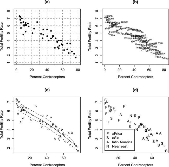
Figure 1 Four Versions of a Scatterplot of the Total Fertility Rate (Number of Expected Births per Woman) Versus the Percentage of Contraceptors Among Married Women of Childbearing Age, for 50 Developing Nations
- A traditional scatterplot is shown in Panel A.
- In Panel B, the names of the countries are graphed in place of points. The names are drawn at random angles to minimize overplotting, but many are still hard to read; if the graph were enlarged without proportionally enlarging the plotted text, this problem would be decreased.
- Panel C displays a more modern version of the scatterplot: Grid lines are suppressed; tick marks do not project into the graph; the data are plotted as open, rather than filled, circles to make it easier to discern partially overplotted points; and the axes are drawn just to enclose the data. The solid curve in the graph represents a robust nonparametric regression smooth; the two broken curves are smoothes based on the positive and negative residuals from the nonparametric regression, and are robust estimates of the standard deviation of the residuals in each direction. The relationship between fertility and contraceptive use is nearly linear; the residuals have near-constant spread and appear symmetrically distributed around the regression curve. More information on smoothing scatterplots may be found in Fox (2000).
- Panel D illustrates how the values of a third, categorical variable may be encoded on a scatterplot. Here, region is encoded using discriminable letters. Similar encodings employ different colors or plotting symbols.
Beyond the illustrations in Figure 1, there are a number of important variations on and extensions of the simple bivariate scatterplot: Three dimensional dynamic scatterplots may be rotated on a computer screen to examine the relationship among three variables; scatterplot matrices show all pairwise marginal relationships among a set of variables; and interactive statistical graphics permit the identification of points on a scatterplot, and the linking of scatterplots to one another and to other graphical displays. These and other strategies are discussed in Cleveland (1993) and Jacoby (1997).
...
- Analysis of Variance
- Association and Correlation
- Association
- Association Model
- Asymmetric Measures
- Biserial Correlation
- Canonical Correlation Analysis
- Correlation
- Correspondence Analysis
- Intraclass Correlation
- Multiple Correlation
- Part Correlation
- Partial Correlation
- Pearson's Correlation Coefficient
- Semipartial Correlation
- Simple Correlation (Regression)
- Spearman Correlation Coefficient
- Strength of Association
- Symmetric Measures
- Basic Qualitative Research
- Basic Statistics
- F Ratio
- N(n)
- t-Test
- X¯
- Y Variable
- z-Test
- Alternative Hypothesis
- Average
- Bar Graph
- Bell-Shaped Curve
- Bimodal
- Case
- Causal Modeling
- Cell
- Covariance
- Cumulative Frequency Polygon
- Data
- Dependent Variable
- Dispersion
- Exploratory Data Analysis
- Frequency Distribution
- Histogram
- Hypothesis
- Independent Variable
- Measures of Central Tendency
- Median
- Null Hypothesis
- Pie Chart
- Regression
- Standard Deviation
- Statistic
- Causal Modeling
- DISCOURSE/CONVERSATION ANALYSIS
- Econometrics
- Epistemology
- Ethnography
- Evaluation
- Event History Analysis
- Experimental Design
- Factor Analysis and Related Techniques
- Feminist Methodology
- Generalized Linear Models
- HISTORICAL/COMPARATIVE
- Interviewing in Qualitative Research
- Latent Variable Model
- LIFE HISTORY/BIOGRAPHY
- LOG-LINEAR MODELS (CATEGORICAL DEPENDENT VARIABLES)
- Longitudinal Analysis
- Mathematics and Formal Models
- Measurement Level
- Measurement Testing and Classification
- Multilevel Analysis
- Multiple Regression
- Qualitative Data Analysis
- Sampling in Qualitative Research
- Sampling in Surveys
- Scaling
- Significance Testing
- Simple Regression
- Survey Design
- Time Series
- ARIMA
- Box-Jenkins Modeling
- Cointegration
- Detrending
- Durbin-Watson Statistic
- Error Correction Models
- Forecasting
- Granger Causality
- Interrupted Time-Series Design
- Intervention Analysis
- Lag Structure
- Moving Average
- Periodicity
- Serial Correlation
- Spectral Analysis
- Time-Series Cross-Section (TSCS) Models
- Time-Series Data (Analysis/Design)
- Trend Analysis
Get a 30 day FREE TRIAL
-
 Watch videos from a variety of sources bringing classroom topics to life
 -
Read modern, diverse business cases
-
Explore hundreds of books and reference titles

Read next

More like this
Sage Recommends
We found other relevant content for you on other Sage platforms.
Have you created a personal profile? Login or create a profile so that you can save clips, playlists and searches