
Entry
Reader's guide
Entries A-Z
Bar Graph
Bar graphs are one of the simplest ways of illustrating the relative frequencies or proportions of variables with discrete values. Typically, the bars representing the different values (e.g., age ranges, level of education, political affiliation, first language) rise from the x-axis, with the height of the bar representing the frequency, which can be read from the y-axis. It is also possible to produce bar graphs so that the bars are set along the y-axis and the frequencies are read from the x-axis, in which case the graph is called a horizontal bar graph. In this simple form, bar graphs display information that could also be displayed graphically using a two-dimensional pie chart. Figure 1 gives an example of a bar graph containing information on number of children in a group of 100 families. It gives an easy way of seeing the modal number of children (2) as well as the low frequency of larger families.
Figure 2 is an example of a horizontal bar graph that shows the proportions of different ethnic groups who made up the population of a British city according to the 1991 census.
Bar graphs can be adapted to contain information on more than one variable through the use of clustering or stacking. Figures 3 and 4 illustrate the information on ethnicity contained in Figure 2 when the age structure of the population is taken into account. Figure 3 is an example of a clustered bar chart where each column sums to 100%. This shows us that the various ethnic groups have different population structures, but does not tell us what that means in terms of absolute numbers. Figure 4, on the other hand, stacks the populations next to each other, comparing white with all the minority groups, and retains the actual frequencies.
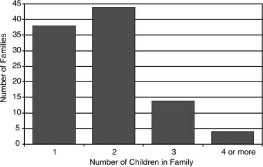
Figure 1 The Number of Children Per Family in a Sample of 100 Families
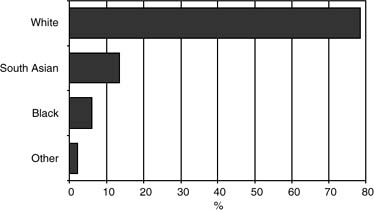
Figure 2 Bar Graph Showing the Ethnic Group Population Proportions in a British City, 1991
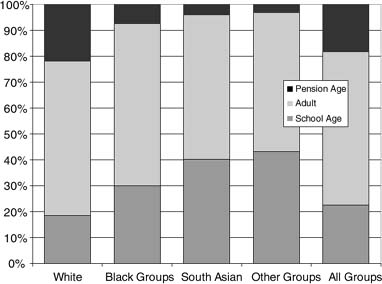
Figure 3 Stacked Bar Graph Showing the Population Structure of Different Ethnic Groups in a British City, 1991
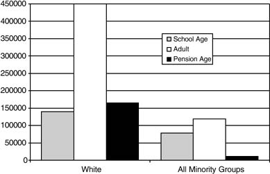
Figure 4 Clustered Bar Graph Comparing the Population Age Structure of White and Minority Ethnic Groups in a British City, 1991
The use of bar graphs to display data not only is a convenient way of summarizing information in an accessible form, but also, as John Tukey was at pains to argue, can lead us to insights into the data themselves. Therefore, it is perhaps surprising that the origins of the bar graph cannot be found before Charles Playfair's development of charts for statistical and social data at the end of the 18th century. Now, however, the development of software simplified the creation of graphs, including the more complex, three dimensional stacked and clustered graphs, as well as the adjustment of their appearance, gridlines, and axes. The use of bar graphs in the social sciences to describe data and their characteristics swiftly and accessibly is not only widespread but also expected. Nevertheless, the choices (e.g., type of bar graph, which data should be contained within the bar and which should form the axis, frequency or proportion) can still require considerable thought and may have implications for how the data are understood.
...
- Analysis of Variance
- Association and Correlation
- Association
- Association Model
- Asymmetric Measures
- Biserial Correlation
- Canonical Correlation Analysis
- Correlation
- Correspondence Analysis
- Intraclass Correlation
- Multiple Correlation
- Part Correlation
- Partial Correlation
- Pearson's Correlation Coefficient
- Semipartial Correlation
- Simple Correlation (Regression)
- Spearman Correlation Coefficient
- Strength of Association
- Symmetric Measures
- Basic Qualitative Research
- Basic Statistics
- F Ratio
- N(n)
- t-Test
- X¯
- Y Variable
- z-Test
- Alternative Hypothesis
- Average
- Bar Graph
- Bell-Shaped Curve
- Bimodal
- Case
- Causal Modeling
- Cell
- Covariance
- Cumulative Frequency Polygon
- Data
- Dependent Variable
- Dispersion
- Exploratory Data Analysis
- Frequency Distribution
- Histogram
- Hypothesis
- Independent Variable
- Measures of Central Tendency
- Median
- Null Hypothesis
- Pie Chart
- Regression
- Standard Deviation
- Statistic
- Causal Modeling
- DISCOURSE/CONVERSATION ANALYSIS
- Econometrics
- Epistemology
- Ethnography
- Evaluation
- Event History Analysis
- Experimental Design
- Factor Analysis and Related Techniques
- Feminist Methodology
- Generalized Linear Models
- HISTORICAL/COMPARATIVE
- Interviewing in Qualitative Research
- Latent Variable Model
- LIFE HISTORY/BIOGRAPHY
- LOG-LINEAR MODELS (CATEGORICAL DEPENDENT VARIABLES)
- Longitudinal Analysis
- Mathematics and Formal Models
- Measurement Level
- Measurement Testing and Classification
- Multilevel Analysis
- Multiple Regression
- Qualitative Data Analysis
- Sampling in Qualitative Research
- Sampling in Surveys
- Scaling
- Significance Testing
- Simple Regression
- Survey Design
- Time Series
- ARIMA
- Box-Jenkins Modeling
- Cointegration
- Detrending
- Durbin-Watson Statistic
- Error Correction Models
- Forecasting
- Granger Causality
- Interrupted Time-Series Design
- Intervention Analysis
- Lag Structure
- Moving Average
- Periodicity
- Serial Correlation
- Spectral Analysis
- Time-Series Cross-Section (TSCS) Models
- Time-Series Data (Analysis/Design)
- Trend Analysis
Get a 30 day FREE TRIAL
-
 Watch videos from a variety of sources bringing classroom topics to life
 -
Read modern, diverse business cases
-
Explore hundreds of books and reference titles

Read next

More like this
Sage Recommends
We found other relevant content for you on other Sage platforms.
Have you created a personal profile? Login or create a profile so that you can save clips, playlists and searches