
Entry
Reader's guide
Entries A-Z
Subject index
Scatterplots
Scatterplots are graphical displays that explore relationships between variables by plotting points at the coordinates of the variables being plotted. The simplest scatterplots are used to explore bivariate relationships between two variables. These variables are traditionally both quantitative; however, this does not need to be the case. Scatterplots plot the (x, y) coordinates of the two variables of interest and every point in the plot represents an individual data point. This entry explores in more detail the creation, uses, and limitations of scatterplots in educational research.
Basic Scatterplot Creation
In the simplest most common case, scatterplots are made by plotting the (x, y) coordinates of two variables in a data set. The example in Figure 1 uses school district data to show the relationship between the percent proficient in Grade 3 on a standardized achievement test and the percentage of students eligible for free or reduced price lunch (FRL). Each point in the figure is plotted at its (x, y) coordinates and represents a unique school district. For example, the point farthest to the right has (x, y) coordinates of approximately (100, 60) indicating that this school district has 100% of their students eligible for FRL and that approximately 60% of their students were proficient in grade three. Similar statements could be made from every point shown in the scatterplot in Figure 1.
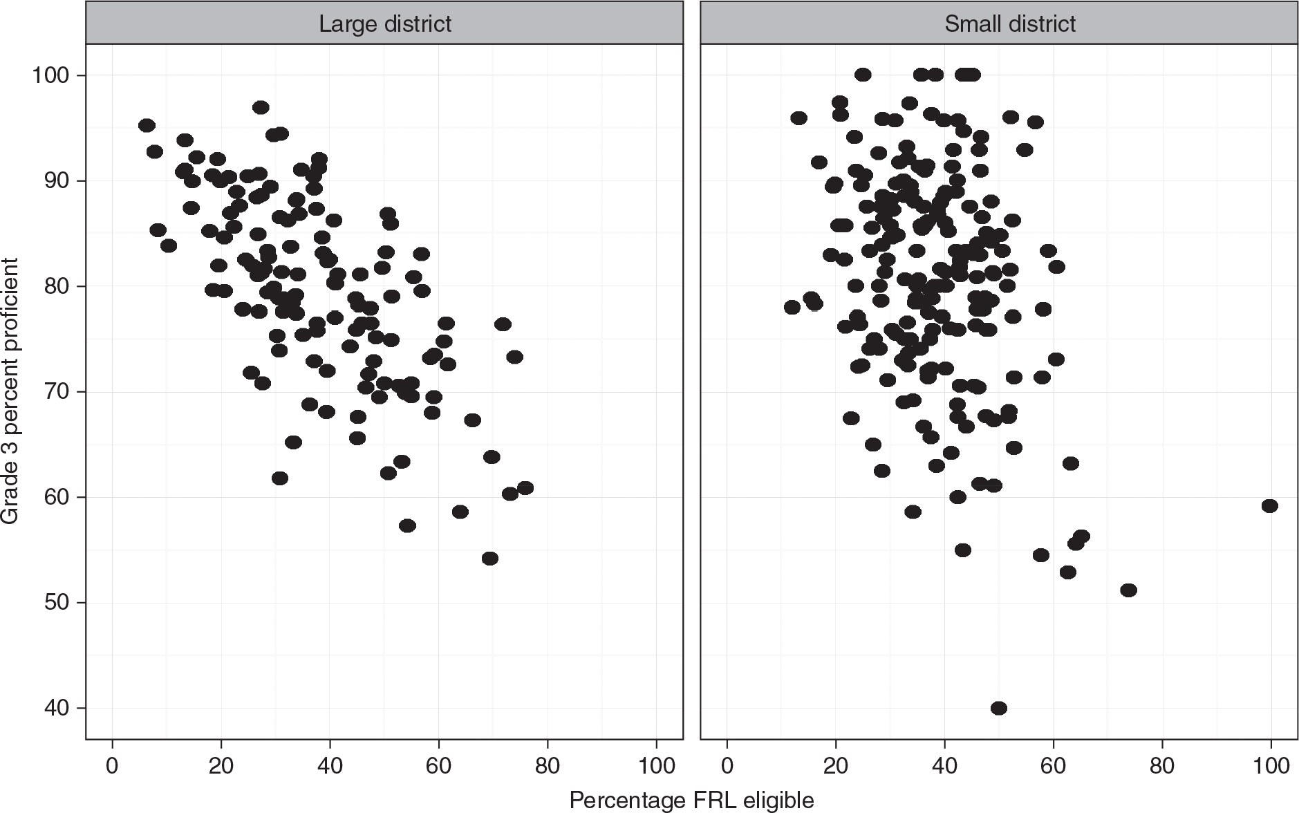
Traditional scatterplots are two dimensional; however, three-dimensional scatterplots can be made that plot points using the (x, y, z) coordinates of three variables. Three-dimensional scatterplots can become difficult to view, particularly in print form; therefore, it is much more common to create two-dimensional scatterplots. An alternative to include additional variables, especially qualitative variables, is to change the shape of the points or facet the plot into separate panels. An example of faceting is shown in Figure 2 where two scatterplots are created, one representing small school districts and a second representing large school districts. These types of figures as shown in Figure 2 are helpful to explore if the relationship changes, or is moderated, as a function of a third variable.
Figure 1 Grade 3 percent proficient by the percentage of students eligible for a free or reduced price lunch for school districts
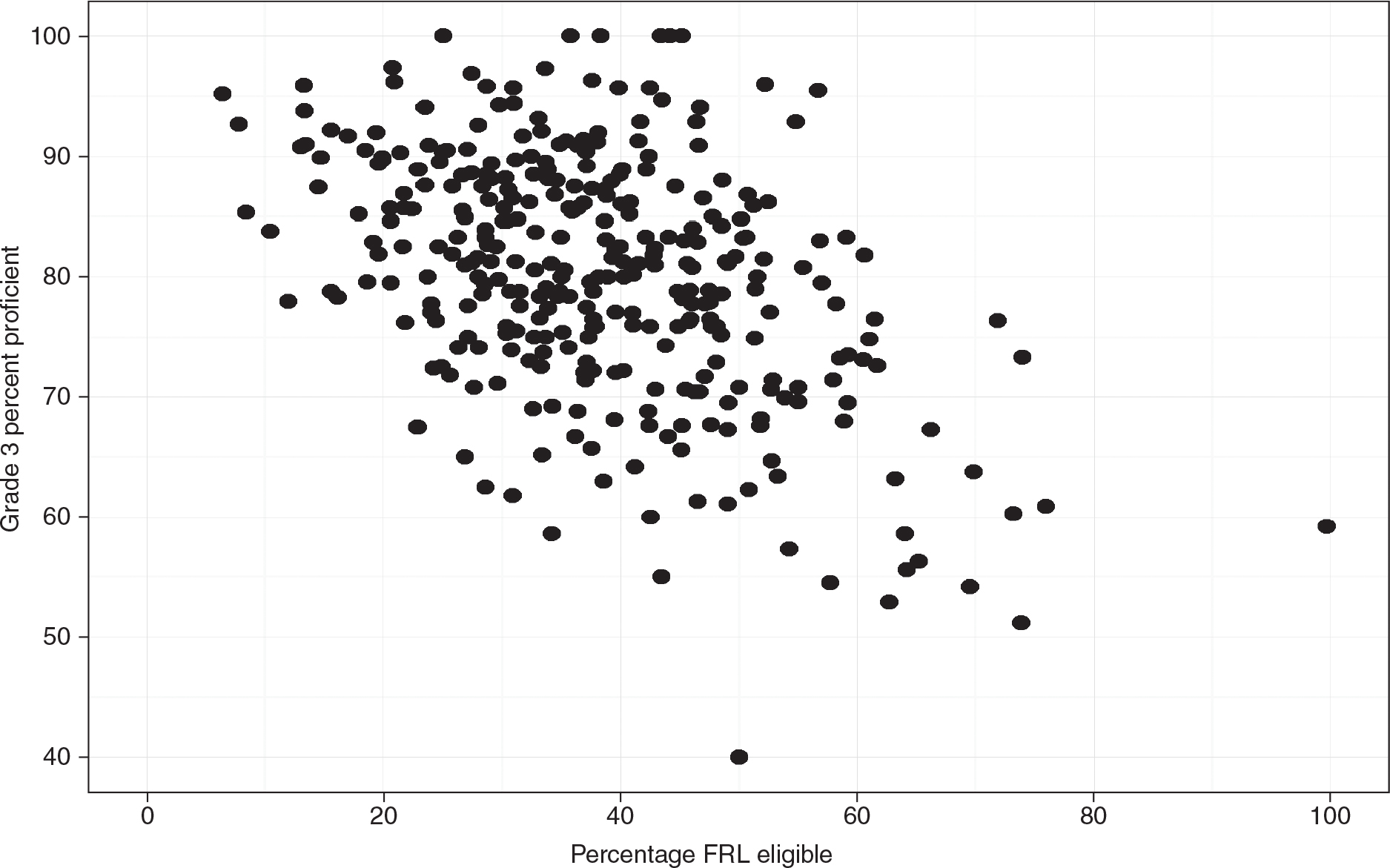
Figure 2 Grade 3 percent proficient by the percentage of students eligible for a free or reduced price lunch and school district size
Data used in the first two figures explore the relationship between two quantitative variables. Data do not need to be quantitative to be plotted in a scatterplot. Instead, data on the x-axis could be qualitative, categorical, or ordinal. Figure 3 provides an example of such a plot where the population density of the counties are plotted for various states. Each point in the plot represents a unique county in each state. The primary difficulty in this approach is issues of overplotting. This is discussed in more detail in the limitations section later in this entry.
Uses for Scatterplots
There are many uses for scatterplots in educational research including estimating correlations, exploring the form of bivariate relationships (i.e., linear or nonlinear), creating interaction plots, detecting outliers, and assessing model assumptions. As an example, from Figure 1, one can easily see the negative bivariate relationship between the percentage proficient at Grade 3 and the percentage of students eligible for FRL. Also from Figure 1, the correlation between the two variables could be estimated to be close to −0.5, a moderate to large correlation.
...
- Assessment
- Assessment Issues
- Standards for Educational and Psychological Testing
- Accessibility of Assessment
- Accommodations
- African Americans and Testing
- Asian Americans and Testing
- Cheating
- Ethical Issues in Testing
- Gender and Testing
- High-Stakes Tests
- Latinos and Testing
- Minority Issues in Testing
- Second Language Learners, Assessment of
- Test Security
- Testwiseness
- Assessment Methods
- Ability Tests
- Achievement Tests
- Adaptive Behavior Assessments
- Admissions Tests
- Alternate Assessments
- Aptitude Tests
- Attenuation, Correction for
- Attitude Scaling
- Basal Level and Ceiling Level
- Benchmark
- Buros Mental Measurements Yearbook
- Classification
- Cognitive Diagnosis
- Computer-Based Testing
- Computerized Adaptive Testing
- Confidence Interval
- Curriculum-Based Assessment
- Diagnostic Tests
- Difficulty Index
- Discrimination Index
- English Language Proficiency Assessment
- Formative Assessment
- Intelligence Tests
- Interquartile Range
- Minimum Competency Testing
- Mood Board
- Personality Assessment
- Power Tests
- Progress Monitoring
- Projective Tests
- Psychometrics
- Reading Comprehension Assessments
- Screening Tests
- Self-Report Inventories
- Sociometric Assessment
- Speeded Tests
- Standards-Based Assessment
- Summative Assessment
- Technology-Enhanced Items
- Test Battery
- Testing, History of
- Tests
- Value-Added Models
- Written Language Assessment
- Classroom Assessment
- Authentic Assessment
- Backward Design
- Bloom’s Taxonomy
- Classroom Assessment
- Constructed-Response Items
- Curriculum-Based Measurement
- Essay Items
- Fill-in-the-Blank Items
- Formative Assessment
- Game-Based Assessment
- Grading
- Matching Items
- Multiple-Choice Items
- Paper-and-Pencil Assessment
- Performance-Based Assessment
- Portfolio Assessment
- Rubrics
- Second Language Learners, Assessment of
- Selection Items
- Student Self-Assessment
- Summative Assessment
- Supply Items
- Technology in Classroom Assessment
- True-False Items
- Universal Design of Assessment
- Item Response Theory
- Reliability
- Scores and Scaling
- T Scores
- Z Scores
- Age Equivalent Scores
- Analytic Scoring
- Automated Essay Evaluation
- Criterion-Referenced Interpretation
- Decile
- Grade-Equivalent Scores
- Guttman Scaling
- Holistic Scoring
- Intelligence Quotient
- Interval-Level Measurement
- Ipsative Scales
- Levels of Measurement
- Lexiles
- Likert Scaling
- Multidimensional Scaling
- Nominal-Level Measurement
- Norm-Referenced Interpretation
- Normal Curve Equivalent Score
- Ordinal-Level Measurement
- Percentile Rank
- Primary Trait Scoring
- Propensity Scores
- Quartile
- Rankings
- Rating Scales
- Reverse Scoring
- Scales
- Score Reporting
- Semantic Differential Scaling
- Standardized Scores
- Stanines
- Thurstone Scaling
- Visual Analog Scales
- W Difference Scores
- Standardized Tests
- Achievement Tests
- ACT
- Bayley Scales of Infant and Toddler Development
- Beck Depression Inventory
- Dynamic Indicators of Basic Early Literacy Skills
- Educational Testing Service
- Iowa Test of Basic Skills
- Kaufman-ABC Intelligence Test
- Minnesota Multiphasic Personality Inventory
- National Assessment of Educational Progress
- Partnership for Assessment of Readiness for College and Careers
- Peabody Picture Vocabulary Test
- Programme for International Student Assessment
- Progress in International Reading Literacy Study
- Raven’s Progressive Matrices
- SAT
- Smarter Balanced Assessment Consortium
- Standardized Tests
- Standards-Based Assessment
- Stanford-Binet Intelligence Scales
- Summative Assessment
- Torrance Tests of Creative Thinking
- Trends in International Mathematics and Science Study
- Wechsler Intelligence Scales
- Woodcock-Johnson Tests of Achievement
- Woodcock-Johnson Tests of Cognitive Ability
- Woodcock-Johnson Tests of Oral Language
- Validity
- Concurrent Validity
- Consequential Validity Evidence
- Construct Irrelevance
- Construct Underrepresentation
- Content-Related Validity Evidence
- Criterion-Based Validity Evidence
- Measurement Invariance
- Multicultural Validity
- Multitrait–Multimethod Matrix
- Predictive Validity
- Sensitivity
- Social Desirability
- Specificity
- Test Bias
- Unitary View of Validity
- Validity
- Validity Coefficients
- Validity Generalization
- Validity, History of
- Assessment Issues
- Cognitive and Affective Variables
- Data Visualization Methods
- Disabilities and Disorders
- Distributions
- Educational Policies
- Brown v. Board of Education
- Adequate Yearly Progress
- Americans with Disabilities Act
- Coleman Report
- Common Core State Standards
- Corporal Punishment
- Every Student Succeeds Act
- Family Educational Rights and Privacy Act
- Great Society Programs
- Health Insurance Portability and Accountability Act
- Inclusion
- Individualized Education Program
- Individuals With Disabilities Education Act
- Least Restrictive Environment
- No Child Left Behind Act
- Policy Research
- Race to the Top
- School Vouchers
- Special Education Identification
- Special Education Law
- State Standards
- Evaluation Concepts
- Evaluation Designs
- Appreciative Inquiry
- CIPP Evaluation Model
- Collaborative Evaluation
- Consumer-Oriented Evaluation Approach
- Cost–Benefit Analysis
- Culturally Responsive Evaluation
- Democratic Evaluation
- Developmental Evaluation
- Empowerment Evaluation
- Evaluation Capacity Building
- Evidence-Centered Design
- External Evaluation
- Feminist Evaluation
- Formative Evaluation
- Four-Level Evaluation Model
- Goal-Free Evaluation
- Internal Evaluation
- Needs Assessment
- Participatory Evaluation
- Personnel Evaluation
- Policy Evaluation
- Process Evaluation
- Program Evaluation
- Responsive Evaluation
- Success Case Method
- Summative Evaluation
- Utilization-Focused Evaluation
- Human Development
- Instrument Development
- Accreditation
- Alignment
- Angoff Method
- Body of Work Method
- Bookmark Method
- Construct-Related Validity Evidence
- Content Analysis
- Content Standard
- Content Validity Ratio
- Curriculum Mapping
- Cut Scores
- Ebel Method
- Equating
- Instructional Sensitivity
- Item Analysis
- Item Banking
- Item Development
- Learning Maps
- Modified Angoff Method
- Norming
- Proficiency Levels in Language
- Readability
- Score Linking
- Standard Setting
- Table of Specifications
- Vertical Scaling
- Organizations and Government Agencies
- American Educational Research Association
- American Evaluation Association
- American Psychological Association
- Educational Testing Service
- Institute of Education Sciences
- Interstate School Leaders Licensure Consortium Standards
- Joint Committee on Standards for Educational Evaluation
- National Council on Measurement in Education
- National Science Foundation
- Office of Elementary and Secondary Education
- Organisation for Economic Co-operation and Development
- Partnership for Assessment of Readiness for College and Careers
- Smarter Balanced Assessment Consortium
- Teachers’ Associations
- U.S. Department of Education
- World Education Research Association
- Professional Issues
- Diagnostic and Statistical Manual of Mental Disorders
- Guiding Principles for Evaluators
- Standards for Educational and Psychological Testing
- Accountability
- Certification
- Classroom Observations
- Compliance
- Confidentiality
- Conflict of Interest
- Data-Driven Decision Making
- Educational Researchers, Training of
- Ethical Issues in Educational Research
- Ethical Issues in Evaluation
- Ethical Issues in Testing
- Evaluation Consultants
- Federally Sponsored Research and Programs
- Framework for Teaching
- Licensure
- Professional Development of Teachers
- Professional Learning Communities
- School Psychology
- Teacher Evaluation
- Teachers’ Associations
- Publishing
- Qualitative Research
- Auditing
- Delphi Technique
- Discourse Analysis
- Document Analysis
- Ethnography
- Field Notes
- Focus Groups
- Grounded Theory
- Historical Research
- Interviewer Bias
- Interviews
- Market Research
- Member Check
- Narrative Research
- Naturalistic Inquiry
- Participant Observation
- Qualitative Data Analysis
- Qualitative Research Methods
- Transcription
- Trustworthiness
- Research Concepts
- Applied Research
- Aptitude-Treatment Interaction
- Causal Inference
- Data
- Ecological Validity
- External Validity
- File Drawer Problem
- Fraudulent and Misleading Data
- Generalizability
- Hypothesis Testing
- Impartiality
- Interaction
- Internal Validity
- Objectivity
- Order Effects
- Representativeness
- Response Rate
- Scientific Method
- Type III Error
- Research Designs
- ABA Designs
- Action Research
- Case Study Method
- Causal-Comparative Research
- Cross-Cultural Research
- Crossover Design
- Design-Based Research
- Double-Blind Design
- Experimental Designs
- Gain Scores, Analysis of
- Latin Square Design
- Meta-Analysis
- Mixed Methods Research
- Monte Carlo Simulation Studies
- Nonexperimental Designs
- Pilot Studies
- Posttest-Only Control Group Design
- Pre-experimental Designs
- Pretest–Posttest Designs
- Quasi-Experimental Designs
- Regression Discontinuity Analysis
- Repeated Measures Designs
- Single-Case Research
- Solomon Four-Group Design
- Split-Plot Design
- Static Group Design
- Time Series Analysis
- Triple-Blind Studies
- Twin Studies
- Zelen’s Randomized Consent Design
- Research Methods
- Classroom Observations
- Cluster Sampling
- Control Variables
- Convenience Sampling
- Debriefing
- Deception
- Expert Sampling
- Judgment Sampling
- Markov Chain Monte Carlo Methods
- Quantitative Research Methods
- Quota Sampling
- Random Assignment
- Random Selection
- Replication
- Simple Random Sampling
- Snowball Sampling
- Stratified Random Sampling
- Survey Methods
- Systematic Sampling
- Weighting
- Research Tools
- Amos
- ATLAS.ti
- BILOG-MG
- Bubble Drawing
- C Programming Languages
- Collage Technique
- Computer Programming in Quantitative Analysis
- Concept Mapping
- EQS
- Excel
- FlexMIRT
- HLM
- HyperResearch
- IRTPRO
- Johari Window
- Kelly Grid
- LISREL
- Mplus
- National Assessment of Educational Progress
- NVivo
- PARSCALE
- Programme for International Student Assessment
- Progress in International Reading Literacy Study
- R
- SAS
- SPSS
- Stata
- Surveys
- Trends in International Mathematics and Science Study
- UCINET
- Social and Ethical Issues
- 45 CFR Part 46
- Accessibility of Assessment
- Accommodations
- Accreditation
- African Americans and Testing
- Alignment
- Asian Americans and Testing
- Assent
- Belmont Report
- Cheating
- Confidentiality
- Conflict of Interest
- Corporal Punishment
- Cultural Competence
- Deception in Human Subjects Research
- Declaration of Helsinki
- Dropouts
- Ethical Issues in Educational Research
- Ethical Issues in Evaluation
- Ethical Issues in Testing
- Falsified Data in Large-Scale Surveys
- Flynn Effect
- Fraudulent and Misleading Data
- Gender and Testing
- High-Stakes Tests
- Human Subjects Protections
- Human Subjects Research, Definition of
- Informed Consent
- Institutional Review Boards
- ISO 20252
- Latinos and Testing
- Minority Issues in Testing
- Nuremberg Code
- Second Language Learners, Assessment of
- Service-Learning
- Social Justice
- STEM Education
- Social Network Analysis
- Statistics
- Bayesian Statistics
- Statistical Analyses
- t Tests
- Analysis of Covariance
- Analysis of Variance
- Binomial Test
- Canonical Correlation
- Chi-Square Test
- Cluster Analysis
- Cochran Q Test
- Confirmatory Factor Analysis
- Cramér’s V Coefficient
- Descriptive Statistics
- Discriminant Function Analysis
- Exploratory Factor Analysis
- Fisher Exact Test
- Friedman Test
- Goodness-of-Fit Tests
- Hierarchical Regression
- Inferential Statistics
- Kolmogorov-Smirnov Test
- Kruskal-Wallis Test
- Levene’s Homogeneity of Variance Test
- Logistic Regression
- Mann-Whitney Test
- Mantel-Haenszel Test
- McNemar Change Test
- Measures of Central Tendency
- Measures of Variability
- Median Test
- Mixed Model Analysis of Variance
- Multiple Linear Regression
- Multivariate Analysis of Variance
- Part Correlations
- Partial Correlations
- Path Analysis
- Pearson Correlation Coefficient
- Phi Correlation Coefficient
- Repeated Measures Analysis of Variance
- Simple Linear Regression
- Spearman Correlation Coefficient
- Standard Error of Measurement
- Stepwise Regression
- Structural Equation Modeling
- Survival Analysis
- Two-Way Analysis of Variance
- Two-Way Chi-Square
- Wilcoxon Signed Ranks Test
- Statistical Concepts
- p Value
- R2
- Alpha Level
- Autocorrelation
- Bonferroni Procedure
- Bootstrapping
- Categorical Data Analysis
- Central Limit Theorem
- Conditional Independence
- Convergence
- Correlation
- Data Mining
- Dummy Variables
- Effect Size
- Estimation Bias
- Eta Squared
- Gauss-Markov Theorem
- Holm’s Sequential Bonferroni Procedure
- Kurtosis
- Latent Class Analysis
- Local Independence
- Longitudinal Data Analysis
- Matrix Algebra
- Mediation Analysis
- Missing Data Analysis
- Multicollinearity
- Odds Ratio
- Parameter Invariance
- Parameter Mean Squared Error
- Parameter Random Error
- Post Hoc Analysis
- Power
- Power Analysis
- Probit Transformation
- Residuals
- Robust Statistics
- Sample Size
- Significance
- Simpson’s Paradox
- Skewness
- Standard Deviation
- Type I Error
- Type II Error
- Type III Error
- Variance
- Winsorizing
- Statistical Models
- Teaching and Learning
- Active Learning
- Andragogy
- Bilingual Education, Research on
- College Success
- Constructivist Approach
- Cooperative Learning
- Curriculum
- Distance Learning
- Dropouts
- Evidence-Based Interventions
- Framework for Teaching
- Head Start
- Homeschooling
- Instructional Objectives
- Instructional Rounds
- Kindergarten
- Kinesthetic Learning
- Laddering
- Learning Progressions
- Learning Styles
- Learning Theories
- Literacy
- Mastery Learning
- Montessori Schools
- Out-of-School Activities
- Pygmalion Effect
- Quantitative Literacy
- Reading Comprehension
- Scaffolding
- School Leadership
- Self-Directed Learning
- Service-Learning
- Social Learning
- Socio-Emotional Learning
- STEM Education
- Waldorf Schools
- Theories and Conceptual Frameworks
- g Theory of Intelligence
- Ability–Achievement Discrepancy
- Andragogy
- Applied Behavior Analysis
- Attribution Theory
- Behaviorism
- Cattell–Horn–Carroll Theory of Intelligence
- Classical Conditioning
- Classical Test Theory
- Cognitive Neuroscience
- Constructivist Approach
- Data-Driven Decision Making
- Debriefing
- Educational Psychology
- Educational Research, History of
- Emotional Intelligence
- Epistemologies, Teacher and Student
- Experimental Phonetics
- Feedback Intervention Theory
- Framework for Teaching
- Generalizability Theory
- Grounded Theory
- Improvement Science Research
- Information Processing Theory
- Instructional Theory
- Item Response Theory
- Learning Progressions
- Learning Styles
- Learning Theories
- Mastery Learning
- Multiple Intelligences, Theory of
- Naturalistic Inquiry
- Operant Conditioning
- Paradigm Shift
- Phenomenology
- Positivism
- Postpositivism
- Pragmatic Paradigm
- Premack Principle
- Punishment
- Reinforcement
- Response to Intervention
- School-Wide Positive Behavior Support
- Scientific Method
- Self-Directed Learning
- Social Cognitive Theory
- Social Learning
- Socio-Emotional Learning
- Speech-Language Pathology
- Terman Study of the Gifted
- Transformative Paradigm
- Triarchic Theory of Intelligence
- True Score
- Unitary View of Validity
- Universal Design in Education
- Wicked Problems
- Zone of Proximal Development
- Threats to Research Validity
- Loading...
Get a 30 day FREE TRIAL
-
 Watch videos from a variety of sources bringing classroom topics to life
 -
Read modern, diverse business cases
-
Explore hundreds of books and reference titles

Read next

More like this
Sage Recommends
We found other relevant content for you on other Sage platforms.
Have you created a personal profile? Login or create a profile so that you can save clips, playlists and searches