
Entry
Entries A-Z
stem and leaf diagram
a form of statistical diagram which effectively enables both the illustration of the broad trends of the data and details of the individual observations. It can be used to represent small samples of scores. There are no foolproof ways of constructing such a diagram effectively apart from trial and error. Take a look at the following diagram:
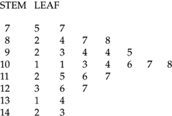
Imagine that the diagram represents the IQ of a class of schoolchildren. The first column is the stem labelled 07, 08,…, 14. These are IQ ranges such that 07 represents IQs in the 70s, 13 represents IQs in the 130s. The leaf indicates the precise IQs of all of the children in the sample. So the row represents a child with an IQ of 75 and a child with an IQ of 77. The last row indicates a child with an IQ of 142 and another with an IQ of 143. Also notice how in general the pattern seems to indicate a roughly normal distribution.
Choosing an appropriate stem is crucial. That is, too many or too few stems make the diagram unhelpful. Furthermore, too many scores and the diagram also becomes unwieldy.
Get a 30 day FREE TRIAL
-
 Watch videos from a variety of sources bringing classroom topics to life
 -
Read modern, diverse business cases
-
Explore hundreds of books and reference titles

Read next

More like this
Sage Recommends
We found other relevant content for you on other Sage platforms.
Have you created a personal profile? Login or create a profile so that you can save clips, playlists and searches